Your Tongue Does Not Have Taste Zones — the Classroom Map That Fooled Generations
Close your eyes and picture a diagram from school science class. It is a pink, cartoonish tongue, neatly divided like a map of tiny countries. Sweet sits at the tip. Salty and sour hug the sides. Bitter lurks at the back, as if guarding the throat. The diagram looked so tidy, so confident, so obviously scientific that most of us never thought to question it. We memorised it, repeated it in exams, and carried it into adulthood as settled fact.
It is not settled fact. It is not even close. The tongue map is one of the most successful errors in the history of science education: a misreading of a real experiment, frozen into a diagram, copied from textbook to textbook for decades, and still taught in some classrooms today. Modern taste science has dismantled it completely. Your tongue has no exclusive taste zones, and it never did.
The claim
The claim, as generations of students learned it, is simple. Different sections of the tongue are exclusively responsible for different basic tastes. Put sugar on the tip of your tongue and you taste sweet; put it on the back and, according to the map, you should taste little or nothing. Bitter belongs at the back, sour and salty along the edges, and each region minds its own business. Some versions of the map add a fifth taste, umami, the savoury taste associated with foods like broth, tomatoes and aged cheese, squeezed in wherever space allows. The core promise, though, is always the same: taste is zoned.
That promise is easy to test, and it fails the moment you try. Press a pinch of sugar against the back of your tongue, or a drop of lemon juice against the tip, and the taste is unmistakable. You do not need laboratory equipment to disprove the map. You need only a kitchen, a few common ingredients and a willingness to distrust a diagram you were handed as a child. Scientists, of course, have done the laboratory version of that test many times over, with careful controls and sensitive instruments, and the result is always the same.
The Verdict
Verdict: False. There are no exclusive taste zones on the human tongue. Every region of the tongue that can detect taste responds to all five basic tastes: sweet, salty, sour, bitter and umami. As Brian Lewandowski, a neuroscientist and taste expert at the Monell Chemical Senses Center in Philadelphia, puts it: “The tongue does not have different regions specialized for different tastes.” He adds that all regions of the tongue that detect taste respond to all five taste qualities, and that the mild regional differences in sensitivity that do exist are small enough that they do not play a clear role in taste perception.
That last sentence matters, because it is the grain of truth inside the myth. The map is not a pure invention. It grew out of a real observation, exaggerated beyond recognition. Some parts of the tongue are very slightly more sensitive to some tastes than others. But slightly more sensitive is not the same as exclusively responsible, and a small difference in detection threshold is not a border on a map. The map turned a whisper of a difference into a wall. Science says there is no wall.
A real experiment, misread for a century
The story begins in 1901, in the laboratory of the pioneering psychologist Wilhelm Wundt, with a German scientist named David Hänig. Hänig wanted to test an idea that now seems obvious but then needed proving: that the four basic tastes known at the time were handled by different receptor mechanisms. His reasoning was elegant. If taste thresholds varied depending on where on the tongue a stimulus was applied, then the machinery behind each taste must itself vary by location.
So Hänig set to work, laboriously measuring taste thresholds at points around the perimeter of the tongue, in what he called the taste belt. He dripped solutions representing sweet, salty, sour and bitter onto different spots and recorded how much stimulus it took before each taste registered. The work was painstaking, and the results were subtle. Thresholds did vary slightly from place to place, and the pattern of variation differed from taste to taste. Hänig had his evidence: the receptor mechanisms were not identical everywhere.
What Hänig did not find was exclusivity. Nowhere in his data does one region taste only one thing. The differences he measured were minute differences in how much stimulus was needed for a taste to register, not differences in whether a taste could be perceived at all. His findings were published as a graph, a line chart showing sensitivity rising and falling gently around the tongue. Read properly, the graph says something modest and interesting. Read carelessly, or redrawn badly, it can be made to say something dramatic and wrong.
That is exactly what happened. In 1942, Harvard psychologist Edwin Boring included a discussion of Hänig’s work in his influential book on the history of sensation and perception. Boring replotted and normalised Hänig’s graphs, and later authors took the redrawn figure and simplified it further. Instead of showing the relative sensitivity to each taste in each region, the new figure listed only the single taste to which each region was most sensitive. Sweet at the front, bitter at the back, salty and sour in between. The gentle hills and valleys of Hänig’s data became flat territories with hard borders. A chart about thresholds had become a map about ownership.
There is a telling detail in how the error spread. Boring’s book became a standard reference for psychology students for decades. Textbook writers copied the simplified figure rather than returning to Hänig’s original paper. Teachers, handed a clean and memorable diagram, taught it enthusiastically. The map’s simplicity was its superpower. It looked like the kind of thing science knows for certain, and it was easy to draw on a blackboard, easy to memorise, and easy to test. Once an error is that teachable, it becomes very hard to kill.
The debunking that should have ended it
If the map had a fair trial, it would have been in 1974, when researcher Virginia Collings revisited the question directly. Collings re-examined Hänig’s premise and ran her own, more sensitive tests across the tongue. Her conclusion was unambiguous: all tastes exist on all parts of the tongue. Wherever there are taste buds, every basic taste can be detected. Threshold sensitivity may differ slightly from place to place, but the intensity of the sensation does not follow the map’s borders. Her work confirmed what a careful reading of Hänig had suggested all along.
And yet the map survived Collings. Into the late 1990s, tongue map experiments were still a teaching tool in high school biology classes. Students were given paper strips impregnated with different tastes and told where each taste should be more noticeable, then instructed to touch the strips to different areas of a lab partner’s tongue and record the result. The exercise was designed to demonstrate the map, and because students expected a particular result, the ritual often seemed to confirm it. Expectation is a powerful ingredient in any tasting experiment, especially one conducted by teenagers on each other in a classroom. A demonstration built around a false premise does not become evidence just because everyone in the room goes along with it.
The persistence is worth pausing over, because it says something important about how misinformation works. The tongue map was not spread by con artists or viral videos. It was spread by textbooks, teachers and examinations: the very institutions we trust to filter out error. It survived because it was simple, visual and plausible, and because correcting it requires explaining cell biology, which is harder than pointing at a diagram. Every generation of students that learned the map became another generation of adults who passed it on, often with genuine confidence. A myth does not need malice to survive. It needs only a good diagram and nobody checking the source.
How taste actually works
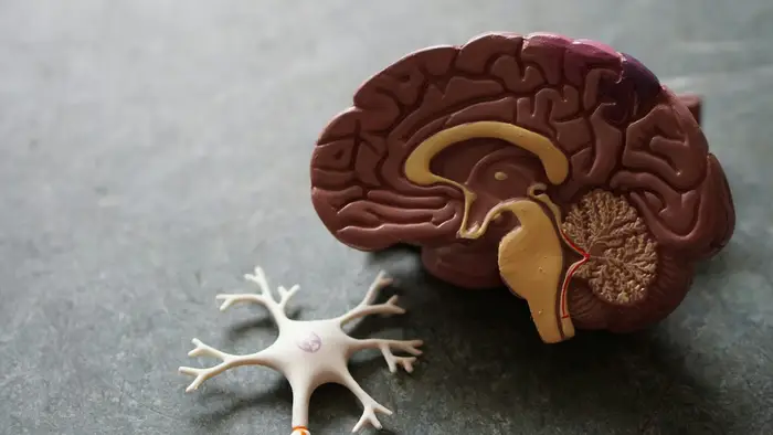
So what is really happening when you eat? The answer starts with taste buds, the sensory organs that detect taste. Each person has between 5,000 and 10,000 taste buds, most of them housed in papillae, the small rounded bumps that cover the upper surface of the tongue. Taste buds are also scattered across the roof of the mouth and the back of the throat. Each taste bud contains around 50 to 100 specialised sensory cells, and crucially, a single taste bud is not dedicated to a single taste. Its cells carry the machinery for detecting the full range of basic tastes.
When you eat or drink, chemicals in the food come into contact with receptor proteins on those taste receptor cells. Sugars, salts, acids and amino acids each interact with their own molecular machinery: sweet and umami tastes are detected through particular receptor proteins, bitter through a large family of receptors, and salty and sour through ion channels that respond to sodium and hydrogen ions. The activated cells release signals that travel along cranial nerves to the brain, where they arrive at an area devoted to processing taste information, the primary gustatory cortex. The cortex interprets the incoming signals and combines them with other sensory information, above all smell, to produce what you experience as flavour.
That last point deserves emphasis, because it explains why the map feels so unnecessary once you understand the real system. Flavour is not a single sense reporting from a single organ. It is a construction, assembled by the brain from taste, smell, texture, temperature and even memory. Steven Munger, director of the Center for Smell and Taste at the University of Florida, notes that the gustatory cortex integrates taste signals with other sensory information, such as smells, allowing us to perceive flavours. He also points out that taste is about more than identification: our preferences, experiences, expectations and motivations can shape how we feel about a taste. The tongue is the front door of this system, not the whole building, and the front door does not have separate entrances for separate flavours.
Why the map feels true
If the map is wrong, why does it feel so right to so many people? Part of the answer is the classroom effect: we believe what we were taught as children, especially when it arrived with a diagram and an exam question. But there are also genuine experiences that seem to support the map, and it is worth explaining them honestly rather than dismissing them.
First, sensitivity really does vary a little. The tip and edges of the tongue are rich in taste buds, and some regions do have slightly lower thresholds for certain tastes. If you test yourself very carefully, with very dilute solutions, you might notice that one taste registers a fraction sooner in one spot than another. That is the real phenomenon Hänig measured. The error is in what people conclude from it. A lower threshold means you need slightly less stimulus to notice a taste. It does not mean the neighbouring region cannot taste it at all, and in everyday eating, where flavours arrive at full strength and wash across the whole mouth, the difference vanishes into irrelevance. As Lewandowski says, the differences are small enough that they do not play a clear role in taste perception.
Second, bitter does have a special relationship with the back of the tongue, but not the one the map implies. The back of the tongue is densely supplied with bitter-sensitive machinery, and bitter tastes there can trigger a strong protective response, including gagging. That makes evolutionary sense: bitter often signals toxins, and the body wants a last line of defence before something harmful is swallowed. But a defensive reflex at the back of the mouth is not the same as a bitter-only zone. The tip of your tongue tastes bitter perfectly well, as anyone who has bitten into an unripe grapefruit can confirm, and the back of your tongue tastes sweet, salty and sour too. A guard post is not a border.
Third, flavour is dominated by smell, and smell can create illusions about where a taste comes from. When you chew, aromatic compounds travel up the back of the throat to the nose, and the brain blends that aroma with the taste signals from the tongue. The result is a single, unified flavour that seems to come from the mouth as a whole. Trying to pin that experience to one patch of tongue is like trying to pin a song to one speaker when the sound fills the room. The map offers a false precision for an experience that is genuinely distributed.
Try it yourself
One of the pleasures of this particular fact-check is that readers can verify it at home in two minutes, without trusting any expert, including this article. You will need four things that are already in most kitchens: something sweet, something salty, something sour and something bitter. Sugar, salt, lemon juice and strong black coffee or a piece of dark chocolate will do nicely.
Start with the sweet test. Place a tiny amount of sugar on the back of your tongue, as far back as is comfortable, and hold it there without swallowing. According to the map, the back of the tongue is bitter territory, so sweetness should be faint or absent. It will not be. The sweetness will be obvious. Now try lemon juice on the tip of your tongue, where the map says sweet lives. The sourness will be unmistakable. Try salt on the back, bitter at the tip, and every combination you can think of. Each taste will show up everywhere, because that is how the system is built.
A few cautions make the test fairer. Use small amounts, and rinse with plain water between tastes so one flavour does not mask the next. Avoid testing while you have a cold, since congestion dulls smell and therefore flavour. And test with a partner if you can, taking turns, so expectation does not steer the result. The classroom version of this experiment went wrong precisely because students were told what to expect before they tasted anything. Blind yourself to the expected answer, and the map collapses on its own.
What the map got wrong about umami
There is another quiet indictment of the map, hiding in plain sight: it has no honest place for umami. The original four-taste version of the map predates the widespread acceptance of umami as a fifth basic taste, the savoury taste associated with glutamate, the compound that gives broth, tomatoes, mushrooms and aged cheese their depth. Hänig never tested for umami, and Boring’s version of the figure did not account for it either. Later textbook artists had to squeeze a fifth territory into a four-territory diagram, which is a little like adding a fifth season to a calendar and pretending it was there all along.
Umami’s awkward fit is revealing. A real theory of taste should have room for a newly recognised taste without redrawing its borders. The modern understanding does: umami is detected by receptor proteins found in taste buds across the tongue, just like the other four tastes, and its signals travel the same neural pathways to the same gustatory cortex. The map, by contrast, treats every taste as a piece of real estate, so each new discovery becomes a zoning dispute. That is a sign of a model built on the wrong foundation. When a framework cannot absorb new knowledge gracefully, the framework is usually the problem.
Why it still matters
It is tempting to file the tongue map under harmless trivia, a quaint classroom error with no real consequences. Nobody, after all, has been harmed by believing that sweet lives at the tip of the tongue. But the map matters for a reason that goes beyond taste. It is a case study in how a small misreading can outlive its correction by half a century, carried forward by the very institutions meant to prevent exactly that. If a false diagram can survive in textbooks for decades after scientists debunked it, what else in our mental furniture arrived the same way, neat and visual and wrong?
The map also matters because it teaches the wrong lesson about how science works. Real science is rarely as tidy as the diagram suggests. It deals in thresholds and distributions, in small differences and overlapping systems, in brains that blend signals from multiple senses into a single experience. The map replaces all of that with coloured zones, and in doing so it makes biology look simpler than it is. Students who learn the map do not just learn a wrong fact; they learn to expect wrong kinds of facts, facts that fit in boxes with hard edges. The world, including the mouth, is messier and more interesting than that.
There is also a practical lesson for anyone who cooks, eats or cares about flavour. Understanding that taste is distributed frees you from a false rulebook. There is no correct patch of tongue to aim a wine at, no zone to target with a sauce, no reason to worry that you are tasting something in the wrong place. Flavour happens when food meets the whole mouth, the nose and the brain together. Chefs have always known this in practice, even when textbooks said otherwise. The best meals are not zoned. They are blended.

The bigger picture: how myths survive debunking
The tongue map belongs to a large family of zombie facts: ideas that have been debunked by experts but refuse to die in popular culture. The family includes the claim that humans use only ten percent of their brains, that sugar makes children hyperactive, and that cracking your knuckles causes arthritis. Each of these myths shares the map’s survival traits. Each is simple. Each is visual or vivid. Each was once taught, or at least repeated, by authority figures. And each is more satisfying than the complicated truth that replaces it.
Debunking alone, the tongue map shows, is not enough. Collings debunked the map in 1974, and classrooms were still demonstrating it in the late 1990s. What finally displaces a zombie fact is not a single paper but a change in what gets taught, drawn and tested. Textbooks have to be rewritten. Exam questions have to change. Teachers have to be given a better diagram, not just told that the old one is wrong. Until the replacement is as teachable as the myth, the myth keeps its advantage. That is a sobering thought for anyone who fact-checks for a living, and a useful one. The goal is not just to be right. It is to be as clear, memorable and shareable as the error.
There is a hopeful side to this story, too. The same institutions that spread the map eventually corrected it, and the correction is now easy to find. BrainFacts, the public outreach arm of the Society for Neuroscience, states the truth plainly for students and teachers. Modern textbooks increasingly describe taste as distributed across the tongue. The map still circulates online, in memes and old worksheets and well-meaning social media posts, but it no longer has the unquestioned authority it once enjoyed. A century after Hänig’s experiment, the record is finally catching up with the data.
The final taste
So the next time someone shows you the tongue map, whether in a classroom, a quiz or a social media post, you will know what to do. You can smile, because the diagram is a familiar old friend, and then you can correct it, because familiar is not the same as true. Sweet is not confined to the tip. Bitter is not locked at the back. Salty and sour are not tenants of the sides. Every part of your tongue that tastes, tastes everything, and the brain does the rest, blending taste with smell, memory and expectation into the rich experience we call flavour.
The real map of taste is not a map at all. It is a network: thousands of taste buds, each containing dozens of sensory cells, each cell equipped to detect the full range of tastes, all reporting to a brain that weaves their signals together with aroma and experience. It is less tidy than the diagram you memorised in school. It is also far more wonderful. A tongue divided into zones would be a crude instrument. The tongue you actually have is a sensitive, distributed, whole-mouth sensor, and it has been tasting everything, everywhere, all along. The map was wrong. Your mouth knew better.